

MSU Department of Linguistics Languages and Cultures (LILAC) Menu

Project Overview
Challenge: Standardize them menu items and organization among all department programs.
Role: UX Researcher and UX Designer
Duration: 2 months
Technologies: Figma and Wordpress
Summary
Working as a website intern for Michigan State University Department of Linguistics, Languages, and Cultures I interacted with the website everyday and found inconsistencies to within the current menu system. I conducted user interviews between both students and staff to develop a new system and format for menu labeling and placement.
Problem
Michigan State University’s Department of Linguistics, Languages, and Cultures is a multifaceted department that has many programs with very distinct brand identities. However, with such varying programs all contained on one website, there are inconsistencies between how each program presents their webpage. These issues are exacerbated by the inconsistencies of the menus labels and column placement between each program. Many students who are studying languages within the department are also doing the self-created major pathway and taking multiple languages courses to obtain their degree. Therefore, these students need to navigate the department website to receive information on opportunities within each program. On the other end of the spectrum, faculty and program heads want a way to promote themselves to possible research grants and graduate students. These different stakeholders need to be able to easily access the same resources on each program webpage and encourage the user to explore more about each program.
How might we establish consistency between the Department of Linguistics Languages and Cultures programs’ menu labels to encourage more interaction to benefit students, faculty, and potential graduate students?

First Steps
At first, I tried to craft a competitor analysis of different menu items of different programs. From there I found a vast arrays of inconsistencies between the menus of the Japanese, Korean, Hebrew, and German. Within the about column was the division or coupling of events. Within the German program, events was coupled with news within this column. That allowed for anyone interested in going to an event could also hear about a faculty member getting an award or funding for research. However, the Japanese program currently has them grouped as “clubs and events” to draw in more interaction between students and their study topic. Another contrast was the ways that study abroad opportunities were labelled and grouped together. The University is currently trying to push vocabulary of the topic toward “education abroad”, but with “study abroad” being more prevalent on the website would students gravitate more toward that labeling? Another key issue is the current placement of abroad opportunities. Some programs have them under resources, while others have them under undergraduate. Other inconsistencies include the placement and label of “jobs and internships”, “courses”, “FAQ”, and “placement test”.


Interviews
I conducted user interviews on about 10 students and 5 faculty within the Department of Linguistics, Languages, and Cultures. These faculty included professors and advisors alike to gain their perspective on how the website should be used. I asked them about their overall use and habits with the website and some paint points and positives as well. The overwhelming majority of students said that they primarily use the website just to look over the requirements for their program and often find the website a bit overwhelming to navigate. On the flip side, advisors also utilize the website mainly for course requirements for students that they are talking to. One of the advisors that I spoke with mentioned that the current menu system is too overwhelming with the amount of programs listed, but he can’t find a way for it to be more simplified. When talking to one of the staff members about the current labels on the menus, they said that their department was advised by the current exchange office that the University is trying to rebrand these experience as “education abroad”. Other staff members let me know that the webpages that are behind each of the labels have big networks of information and can be extremely complicated to change.

“I usually feel overwhelmed navigating the website and usually stick to just using the study abroad and minor requirements pages.”
Card Sorting
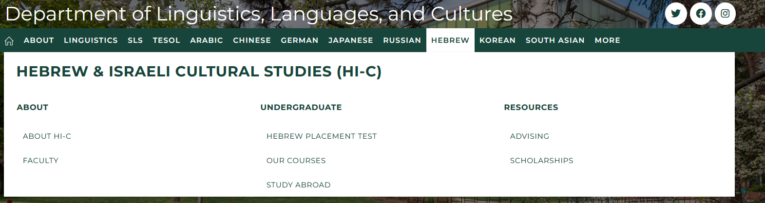
Using the most common combinations of labels, I constructed a card sorting activity that would allow students to sort different menu labels into one of the three different categories: about, undergraduate, and resources. Each of these options allowed for the for users to sort which labels made the most sense to go into each of those categories. This way there would be a guide for each program to go by when laying out the menu items. In the end, the most common solution among the participants was made into a sample menu below.

Deliverables & Reflection
In the end I was able to deliver my findings to the Department of Linguistics, Languages, and Cultures Website team to look over and keep for the future. Unfortunately, the menu is controlled through the College of Arts and Letters website team and the current state of this website is not a high priority. So currently this research is being stored on the team resources page to be accessed when they re-vamp the website. Overall, this experience allowed me to gain a greater perspective on what exactly goes on in the world of academia and how the priorities of professors and students differ. Through working with different stakeholders, I have been able to make compromises and commonalities between both groups to make a satisfactory product for all.
